
This is great and all, but since those are static and the article already discussed the mastheads of such publications, I'm going to dive into movie titles and opening/closing credits where it's not just in print and not just a stamped brand, but instead moves and floats in space while introducing or concluding a feature film.
I'll start with a title of one of this year's summer films Ponyo (2009):

It's like summing up the entire theme of the film in not just in the word itself, but the style it has been designed. The custom font is thick with tiny "bowls" (technical term for the hole) in the O and a nice swishy wave at the bottom of the N. The title alone signifies that this is probably a children's movie that might take place underwater, rather than a horror film like Saw, which uses a disgruntled, dirty look.

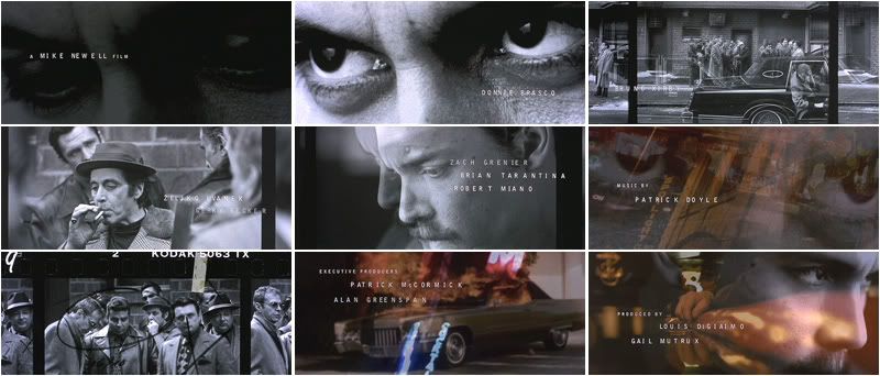
Here we have the opening credits for Donnie Brasco (1997) starring Johnny Depp which used "surveillance-type photography and kerning fonts...which hinted at the character's obsessions and the story of the Mafia's descent into hell" (221). The font face is fairly simple, but the uneven kerning (space between each letter) ages the look and adds raw texture, similar to the stereotypical typewriter lettering on a police record.
(Click any image to see it larger)
(Click any image to see it larger)
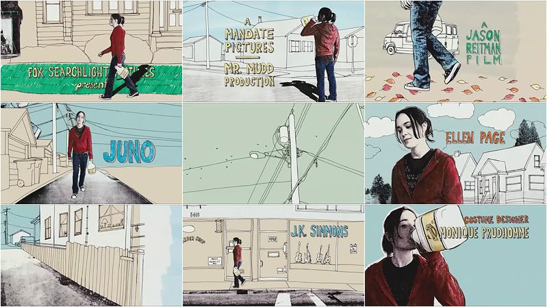
Written by Diablo Cody, Juno (2007) uses handwritten fonts that complement the illustrations in the opening sequence. The opening credits gives the movie originality (though this drawing style never reappears in the film) and sets it apart from other teenage films.
Here are some more:
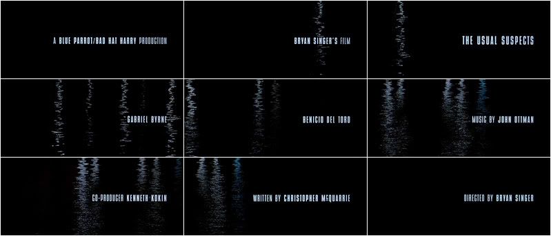
From The Usual Suspects (1995), a stern font with no flourishments, give it a metal look.
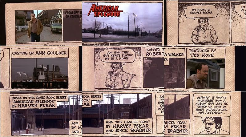
American Splendor (2003) appropriately uses a handwritten font to mimic the comic book the movie is based on.
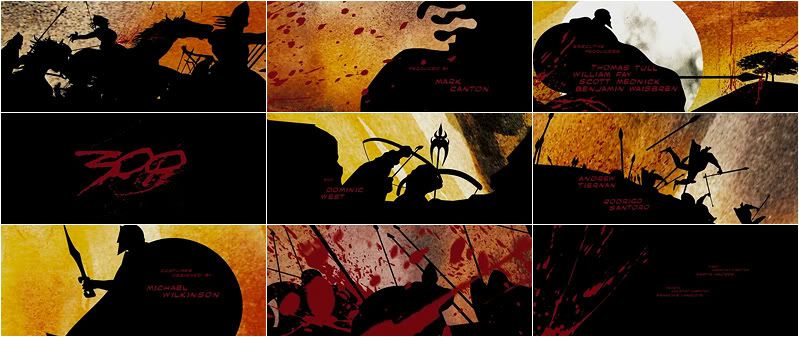
300 (2006), also based on the comic book
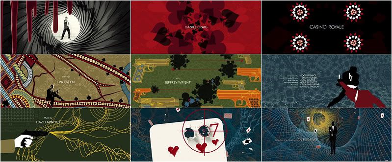
Casino Royale (2006)
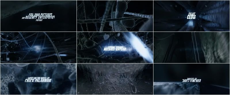
Fight Club (1999), looking hardcore.
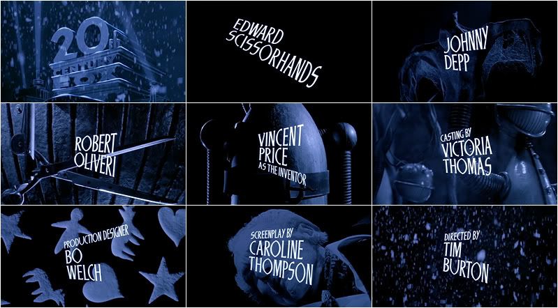
Edward Scissorhands (199) uses a custom font that reflects the shape of scissors.
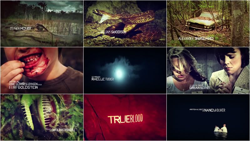
True Blood (2008) has an awesome opening sequence in which the typeface is anything but perfect and clean, which is the way it should be.
You might be thinking that these are obviously appropriate, but that's just taking it for granted. Imagine how dull it would be if we only had Century Gothic or Times New Roman for branding.. yawn. Plus it sets the emotions and adds personality, as Silverblatt says. Anything else out there that sticks in your mind?
Source [all screencap images]- artofthetitle.com
wow Caroline... this is impressive.
ReplyDeleteGreat research!
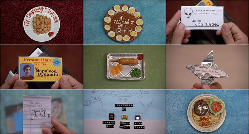
ah! i forgot about the opening credits of Napoleon Dynamite!
ReplyDeleteGOSH :)
Yeah! The ability for different type face to connote different things is so interesting! I worked as a Production Designer on WSN my freshman and sophomore year and the font we used the most was Helvetica and Neue Helvetica. I guess it is because it looks so crisp and... neutral (since Helvetica is the Latin name for Switzerland). Helvetica is quite a popular font for logos. American Apparel, 3M and Microsoft are just a few examples of companies that use Helvetica as its logo. It is quite a celebrated font too, since a documentary with its namesake came out in 2007, celebrating the font's 50th anniversary. Here's the website to the documentary: www.helveticafilm.com
ReplyDelete